


Nastia Levchenko is our UX/UI Designer at Zynap, and she’s rebuilt the design and visual language of our preemptive security automation platform. This is how every decision got made.
Where It Started
In a space where automation platforms are judged almost entirely on their capability, design is often the last conversation, and aesthetics are a nice-to-have. Our team wanted to challenge this.
B2B tech products often struggle for identity. The tools either have the same plain lifeless interfaces or drift to the opposite side, trying to transmit how top-notch the solution is through a fairground of glows, textures, and colours.
Redesigning a technical tool is quite the challenge. Users deserve (and wish for) great product experiences. At the same time, the requirement for functionality above all else has resulted in them becoming accustomed to unappealing interfaces that resemble blueprints.
As a Product Designer, my mission has been to find a balance. Elevate the UI without the risk of it looking dated in a year, respect the patterns and flows technical users already know, and meaningfully improve the UX.
The redesign introduces a more expressive visual language while delivering practical usability improvements. Now workflows and the canvas not only look better, but also feel better to use.

The Workflows
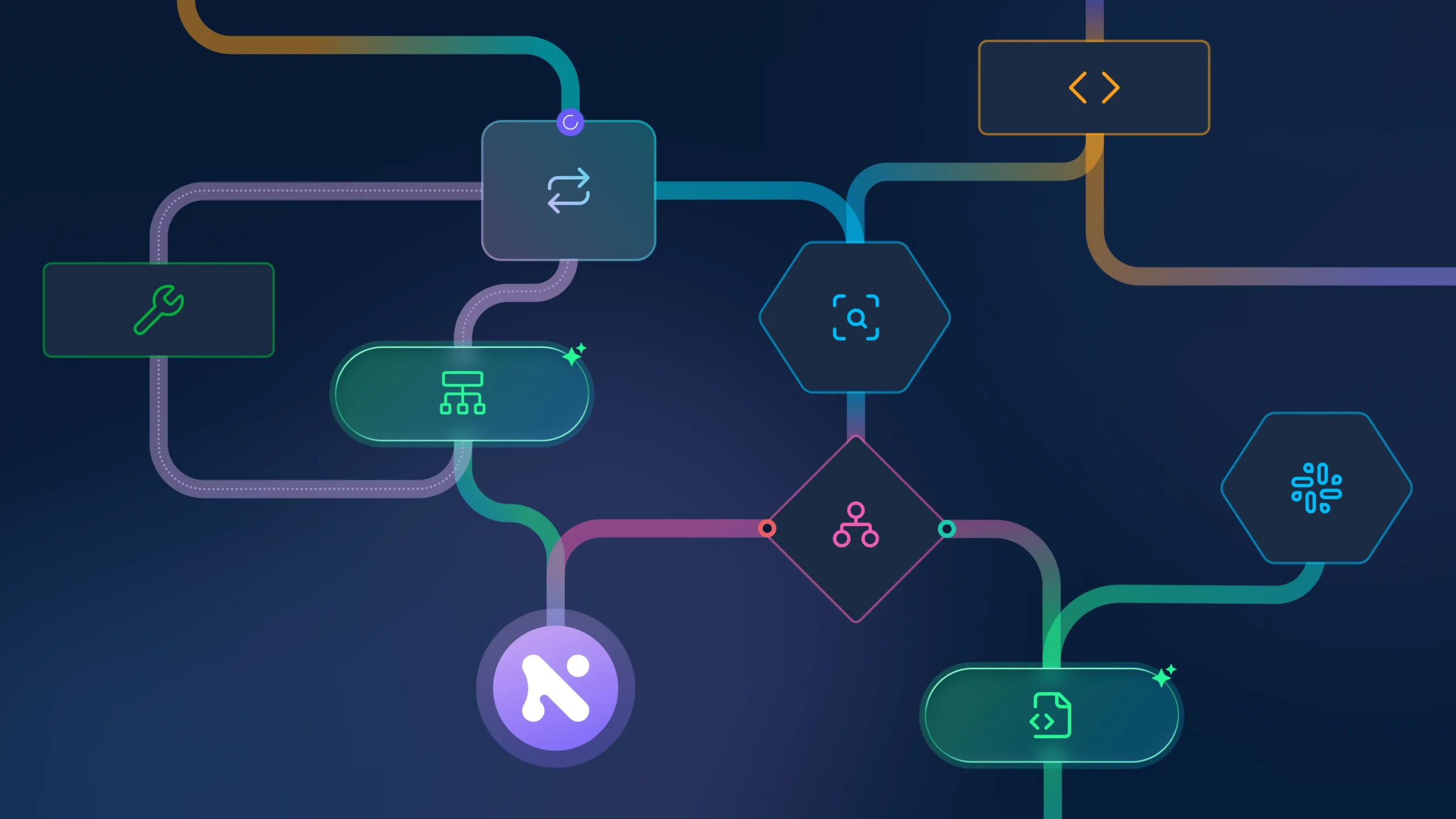
We started with the nodes, with a simple idea in mind: a workflow should communicate what it does, not just execute it.
Each node type needed a distinct visual identity that conveyed its role at a glance, while still holding everything a user needs to see: status indicators, execution states, labels. Beauty and density had to coexist.
The result is a shape language where geometry carries meaning:
- Rounded rectangles for core function nodes and tools → clean, familiar, and efficient
- Elegant hexagons for integrations → distinctive geometry that stands out and signals connectivity
- Dynamic diamonds for conditional logic → visual expression of decision points
- Fluid capsules for AI-powered agents → smooth, organic shapes that convey intelligence and adaptability

The connection lines got the same treatment: wider, smoother edges with gradient transitions that create a more natural sense of system connectivity.
Whilst working on the design language, we kept coming back to a nagging pain point: users struggle for clarity in complex workflows with dozens of nodes and paths crossing in all directions.
The solution came from our Front-End Developer who proposed contextual highlighting: selecting a node makes its connections illuminate while the rest of the nodes and edges step back.
The outcome is a unique feature that guides our users and ensures that even the most complex flows remain legible.
The Canvas
The node redesign introduced a new visual language. Now the space needed to match it.
Our goal was straightforward: the canvas should be a refined backdrop so the workflow takes centre stage. The key improvements we made:
- Modern aesthetics that add depth and create a premium workflow experience
- Visual hierarchy through strategic use of colour, spacing, and elevation
- Collapsible panels detached from screen edges and controls moved to a bottom toolbar to maximise canvas workspace and improve spatial organisation
Every visual detail reinforces our commitment to both powerful functionality and a polished user experience.
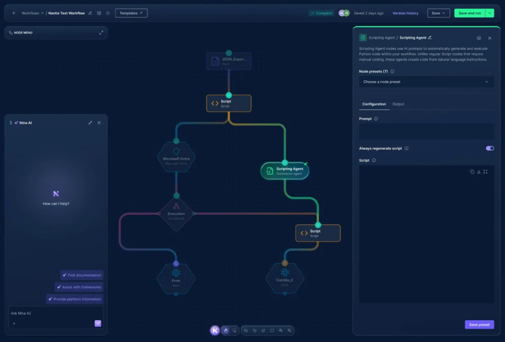
Designing NINA AI
The final ingredient is NINA AI. The vision was to make our multi-agent cybersecurity system a seamlessly integrated workflow companion.
We also wanted NINA to feel unmistakably Zynap.
The Z-to-N animation of the logo, born from an idea by our Head of Product, marks the moment of activation: a small but intentional detail that gives NINA a distinct identity. The purple gradients, the subtle glow, the interactions support her character.
NINA AI is designed to scale beyond the chat panel, extending across the canvas and throughout the platform.

The Bottom Line
What we’ve built is the result of the product and engineering teams working closely together towards something our users can rely on.
The functionality, refined user experience, and visual language are what sets us apart in the cybersecurity automation space.
For us, design was never the afterthought. It was always in the conversation.
Keep Reading
This article was written by Anastasia Levchenko, UX/UI Designer at Zynap. Nastia owns the full design process from research to design and prototyping, gets hands-on with agents and code, and is on a mission to bring beauty and usability to security tooling.
Design and product don’t exist in a vacuum at Zynap. If you’re curious about the other side of the canvas, how AI is reshaping the way the product team works day to day, our Head of Product, Elena Flores, wrote about exactly that in Chapter 2 of Inside AI: How AI Agents Transformed My Product Workflows. The same canvas Nastia redesigned is the one Elena’s workflows run on.
NINA AI is the multi-agent companion that closes this article, Sheijer Silva documented how the engineering team built it in Chapter 5: How We Built NINA, From Coding Agents to Agentic Cybersecurity AI. The same product, from a completely different angle.
And if this article made you think about what UX decisions actually cost, Elena Flores took that question into different territory: It’s Not Phishing, It’s UX: How Platform Design Pushes Users Toward Malware. Roblox accounts appear in Zynap’s compromised credentials database at five times the rate of Google or Facebook. The article examines why.